Showing posts with label Analytics. Show all posts

Friday, June 6, 2008

Catchment Area Analysis (Market Share)

“A new study reveals that electrical cardioverson of hemodynamically stable patients with atrial fibrillation (AF) is the best option when cardiac electrophysiology studies of the atrium show a strain patter”.

This is a completely fictitious study to illustrate how to determine catchment area (or the market share depending on how you choose to define it). Imagine an equally fictitious cardiac electrophysiologist who serves 5 communities from City Alpha population 200,000. Each of the other 4 cities (Bravo, Charlie and Delta) have populations of 100,000. There are 500 family doctors and 3 cardiologists. About ½ of the patients from City Delta are seen in another neighboring centre.

When the study is published the electrophysiologists does an education campaign with the family doctors and cardiologists in the area and now wants to determine if patients with AF area being treated according to the new specifications.

He first determines the rate of AF in the general population. After reviewing population studies he determines that the overall rate of people that will need the electrophysiology study is 2.5 per 1,000 people per year. (As a quick ‘aside’ we’ve found these rates to be predictable for a large number of procedures and disorders). He also knows that the physicians of City Alpha have already adopted the standards of the study and he receives 520 referrals per year. Since (520 * 1,000) / 200,000 = 2.6 the population study is in agreement with his experience. Based on these two checks he determines (at a rate of 2.5 per 1,000) that the number of patients he should be seeing from each of the cities is:

City Alpha: (200,000/1,000*2.5) = 500
City Bravo: (100,000/1,000*2.5) = 250
City Charlie: (100,000/1,000*2.5) = 250
City Delta: (100,000/1,000*2.5) * ½ = 125

After data mining his EMR he determines that the number of actual referred patients is:

City Alpha: 520 (104%)
City Bravo: 240 (96%)
City Charlie: 120 (48%)
City Delta: 180 (144%)

Based on these numbers he determines that City Alpha and Bravo are behaving as predicted. City Charlie is much lower than expected (he subsequently found out a cardiologist hadn’t read the study yet) and that he was seeing many more patients from City Delta than he expected (turns out the neighboring electrophysiologist likes his vacation time).

While these calculations are relatively easy to do on paper they are more complicated in reality because:
-city names are misspelled
-people name an area that is not a census subdivision (e.g. a small hamlet)
-the population counts are over multiple census subdivision areas

The simplest way I found to deal with the mess of data that comes from data mining is to assign a census subdivision to each patient.

In Excel:
Step 1: Download the data. You should have the DateTx, PatientID and PatientCity. Place this in a sheet and name it RawData
Step 2: Create a list of census subdivisions from government data and each population. Call this sheet CensusSub
Step 3: Using the Pivot Table function to create a unique list of PatientCity. Cut and paste that list into a new sheet called CitytoCensus. Next to each unique city/town assign it to one of the census subdivisions (spelled the same way as in the CensusSub sheet)
Step 4: In the RawData sheet add a column to each patient record called Census. Use the vlookup formula to assign a census subdivision to each patient record. The formula will look something like =VLOOKUP(B3, citytocensus!$A$2:$B$20,3,FALSE). See the video below on how to use the vlookup function. The FALSE statement forces an exact match rather than an approximate.
Step 5: Create a PivotTable of the raw data and place the DateTx in the row fields (group by year and quarter) then move it to the column field. Place Census in the row fields and Count of PatientID in the Data Field. This will create a count of patients by quarter, year and census subdivision.
Step 6: Convert to a rate per 1,000: Cut and Paste Special >>Values this summary. Use the census subdivision count (in censussub sheet) and actual patient count per census subdivision to determine the actual rate of referral per 1,000 for each census subdivision.
This last formula will be based on the following:
=Count of PatientID*1,000/censuspopulation
If the censussubdivision is in column A and the Count of PatientID in column B the formula will look something like:
=B2*1000/(VLOOKUP($A2,CENSUSSUB!$A$1:$B$20,2,FALSE)

As usual the devil is in the details. Doing a catchment area analysis is a powerful tool to determine the area and patient population that your office or clinic is covering. Varations in patient load from neighboring area can explain sudden changes in health care wait time. For emergency departments with suddenly long ER wait times it can also determine the cause of surges in patients. If needed I can post a video of doing this in an actual spreadsheet.

Thursday, June 5, 2008

Wait Time Analytics

How long do I have to wait for an appointment?” Our office uses two measures of health care wait time. The wait to get an appointment and the wait once the patient arrives. I have already described the technique we use to measure waiting in the office and the application of six sigma techniques (e.g. a goal that 95% of patients are in the office less than 50min). Today I will discuss measuring wait times for an appointment.

Comparing the wait to get an appointment between offices is difficult because no one seems to agree on how to define it. Time to next available appointment? The mean or median time waited? Some other metric?

Previous posts have described Korner Wait Time, 3rd to Next Available and Mean Time to Wait (MTW). Mean Time to Wait is the difference in days between when the appointment was created and when it occurred. The advantages of MTW are that it’s easily programmed into an Excel spreadsheet to download the data from an EMR (ApptDate – CreateDate) and it can measure an endless supply of appointment types for those who use block booking. The down side is that MTW is a retrospective analysis so changes can lag behind reality by the length of the wait. Because of that of that lag our office also directly measures 3rd to next. The advantage of 3rd to next is that you can see wait time problems in real time. The down side is that without detailed schedule templates and appointment types it has to be measured manually. It is of greater utility in open access booking where there are only a few types of appointments.

Another disadvantage of MTW is that it requires a normal distribution. Mean time to wait can be skewed with a bimodal patient population. Consider a patient class that has both an urgent and non-urgent patient pool (e.g. asthma). Together, the mean is in the trough of a bimodal population which would be an inaccurate reflection of health care wait time:


But separated, the two populations each have their own mean which is more reflective of the average time waited by patients for an appointment.


Interpreting wait time measures is tougher than it looks. Consider office or ER wait times with two different types of appointments each ‘competing’ for the same appointment blocks.

In the first graph the wait is balanced with the two types of appointments increasing and decreasing in proportion to one another.


In the second graph type A is decreasing while type B increases.


This is a common problem in block booking practices where over-booking type A appointments blocks out type B appointments. Typically, appointment type A is easier for a patient to book (less morbidity, less recovery, less time off work, less cost, etc…) and shorter duration. Since type A is easier to book it fills up the appointment slots faster than type B appointments. The more that short, type A appointments are booked the less time will remain for longer type B appointments. The effect is a widening in the wait time between the two appointment types and a lack of access for type B patients.

Having watched this scenario play out several times over the years it tends to occur with a) poor management of a block booking schedule, b) inexperience in the administrative centre c) moving from a slow season to a busy one. Our office also uses the 3rd to next technique to catch these problems as soon as they happen.


Another pattern frequently seen is when two different blocks of appointments of different duration become equal or invert. This usually means that there are open slots in the schedule which can be filled with other blocks of appointments. In the graph below, the soonest that patients choose to book an appointment is 6-8 days.

Our office is procedural based and a specialist office so complete open access would not be effective. Because we combine open access with block booking I've found that monitoring MTW and a real time monitor allows us to control the blocks of time. Monitoring wait times within a practice is a simple metric that maintains wait time equity between patient pools it also lets you better control standards of care for wait times.

Wednesday, June 4, 2008

The Streetwise Doc – A Single Core Metric

Having worked in a mix of private and socialized health care for the past 15 years I have a problem with the concept of the doctor as a poorly organized entrepreneur. I’ve listened to my accounting and financial friends tell me how inept my colleagues are when it comes to economic matters but I stand before you today to say that I’ve seen very few doctors and dentists fall into the social safety net. In fact, I find most have better control over their businesses’ than the typical accountant. They have strong people skills, an intimate knowledge of their business operations and are responsive to the needs of their patients.

At this point, I’m sure that some of my readers are shouting “bullshit”;

“My doctor has all the social grace of three-legged dog with urinary incontinence and the business savvy of Jeffrey Skilling.”

If you compare primary care providers to a typical entrepreneur they have all of the trappings and motivations of a great small business executive. Doctors are intimately connected to their “customer” base, good problem solvers (by necessity if not by nature) and have to adapt to changing patient needs through creative analysis. After all, as medicine advances so do the needs of the practice and with it the doctor. Most health care providers are “streetwise” in the sense that they have a good gut-feel for what is happening in the practice.

Doctors, while well connected, are never given any training in formal practice management short of advice on how to submit and collect billings. They tend to focus on costs not growth or change. Despite having the ability to rapidly change with the needs of their patients, problems in a practice can linger. This tendency is exacerbated where practices are encouraged to accept patients for flat rates that promote growth through greater patient volume rather than better service to the patient. Taking a page from the concepts of Alan Greenspan, history has demonstrated that removal of power from central planners and broadening of market mechanisms encourages the entrepreneurial spirit and improves efficiency. A major concern of mine is that, whether publicly or privately financed, centralized healthcare destroys individual initiative and creative destruction.

It is the responsibility of each provider to draw on their own entrepreneurial spirit and apply their skills of critical analysis to find one core metric. It is a singular value that can stand alone and reflect the health of a practice.

To find the value that is right for an individual health care provider, ask the question “how do we provide care for people?” and apply it an appropriate patient pool. The 5 why’s technique of root cause analysis is a good tool as is a more formal approach to creative analysis (however ironic it may be to have a template for creative analysis).

In the case of my own practice we best serve the community by being an expert resource to generalists. We focus less on the patient pool and more on being accessible to generalists as well has having the expert knowledge they require. There are many dimensions to measuring accessibility and expertise but the core metric we use is the number of patients referred for care. It describes how useful we are to primary care providers and the value they assign to our expertise. To that end, our practice tracks the number of quarterly referrals by generalist, community and patient type.

Nuances in the scope of individual practices make it impossible to describe a single core metric. Rather, each practitioner needs to draw on their inherent ability for creative analysis to determine what numeric value best characterizes the health of their practice then follow it relentlessly.

Monday, June 2, 2008

"What's Your Overhead?"

“What’s your overhead?” is the most frequent question I’m asked about the health of my practice from other surgeons. It’s also the least informative as far as I’m concerned. This week I’ll be posting about various metrics we use to monitor wait times, efficiency and practice management. I’ve left out quality measures which are a separate but related subject.

If the basic premise of good practice management is to do what is best for the patient in a fiscally responsible manner costs become less important than efficiency. The most basic measure of efficiency is the number of days worked. Some clinics use available appointment slots, provider hours or other measures of the amount of provider time available to patients. I prefer doctor days. It has some inherent weaknesses, such as when I spend a couple of hours working administration rather than with patient time but in our practice that time becomes statistically insignificant.

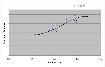
In a fee-for-service model doctor days is highly predictive of revenue. We’ve found that doctor days account for 82% of the variation seen in revenue with a mix of clinic and hospital work (see picture below). When the work is confined to just the clinic, doctor days is even more predictive of revenue.


Notice that the curve plateaus at the far right. There comes a point where you can work more but not generate any more revenue. The days become less efficient as the patients spread out over more and more days. As I’ve posted before doctor days does not correlate well to wait time (in a well managed practice) so there is no benefit to work beyond the edge of the curve for either the patient or doctor.

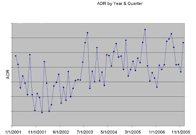
Since doctor days and revenue correlate so well an easy metric to track is Average Daily Revenue (ADR) which is gross revenue (in real dollars) divided by doctor days. Using real dollars to compare year over year changes backs out inflationary changes.


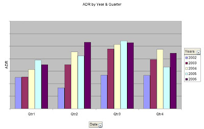
Because of natural variation quarterly analysis should be used rather than month to month. From a practical point of view create a spreadsheet with the first date of the month, gross revenue, corrected dollar amount, days worked and average daily revenue. Create a pivot table using the data and group the dates by year and quarter.

Ungrouped:


Grouped:


See the video below -- grouping dates is at 4:18 in the video:


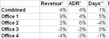
Using the three metrics doctor days, revenue and average daily revenue is simple and informative. If doctor days go up and average daily revenue goes down such that gross revenue has a net zero change the office is less efficient. Either cut doctor days or increase efficiency. Conversely, if the doctor days drop, ADR should increase (fewer days should concentrate patients). A drop in ADR and doctor days is a good indicator of a problem from an administrative point of view. Our office uses these three statistics to predicatively plan doctor days in different offices to maximize overall efficiency.

Sunday, June 1, 2008

Business Analytics Week

Next week I'll be posting five different analytics to use in clinical practice. Whether your clinic is private or publically funding I'm hoping that the business analytics I describe can be used to better manage time and efficiency. The major advangtage (or disadvantage depending on your perspective) of electronic medical & practice management records is that you can use them to create and monitor business metrics in real time.

My assumption is that you can get at your data and create a pivot table in Excel (see this post for details). The concepts I'll post still apply if you cannot but it is harder to analyze your practice when you can not get at any data.

Other links of interest include business analytics, business analysis and data mining.